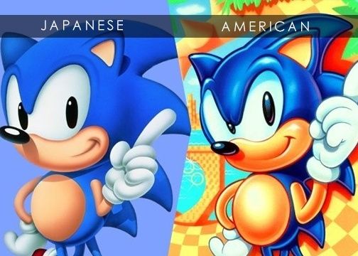
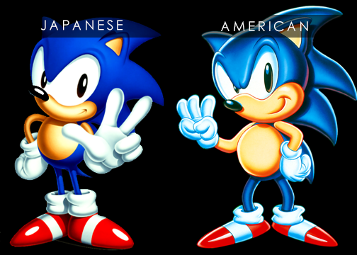
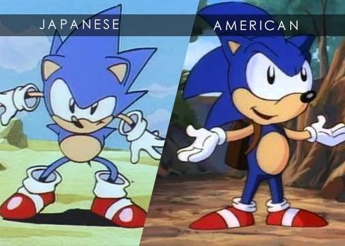
While the debate over Classic vs Modern Sonic goes on. What about the debate about Classic American vs Classic Japanese Sonic? Which classic version is your favorite?
CLASSIC AMERICAN VS CLASSIC JAPANESE COMPARISONS
SONIC THE HEDGEHOG 1

SONIC THE HEDGEHOG 3

SONIC ANIMATION STYLE

Overall, based off the classic eras, the Japanese design (based off Oshima Naoto's deisgn), aged pretty well. The classic American design (based off Greg Martin's design) looks really outdated and 90s. In fact the design of American Sonic reminds me of the 90s Disney cartoon designs.
As far as my favorite, I'm pretty stuck in the middle. I like the clean and sharp design of Japanese Sonic. But I like the color and life of the American design.
Maybe if both designs were fused together, it would be a dope design for Classic Sonic. That's what I kinda did with my drawing artstyle for Sonic.
But if I were to choose just one, I would probably roll with the American Design of Sonic, because it was always colorful compared to Japanese version.
What's your thoughts?


